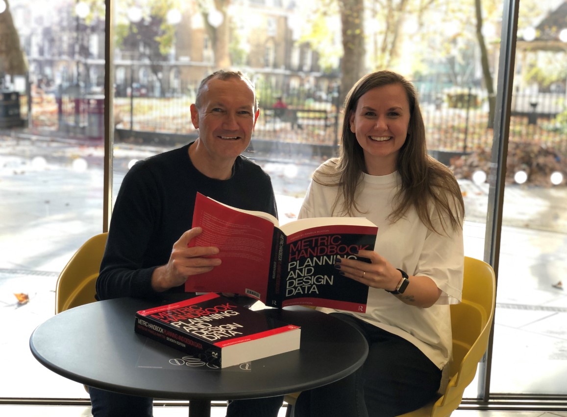
Our CEO, Eddie Miles, and architect and associate, Lucy Dewick-Tew, had the great privilege of updating the retail chapter in the latest edition of the Metric Handbook.
In its seventh edition, this is the go-to-guide for architects, designers and aspiring students.
We spoke to Eddie and Lucy to find out more…
First experiences of the Metric Handbook
“It was one of the first text books that I bought as a student, and it was pretty much the only source of information in architecture for building data and types of building”, recalls Eddie.
“I sound like an old man now but it wasn’t possible to Google anything back then. Having all the information you needed in one place was really useful.
“If you were a student designing something, like an auditorium or one of the projects I worked on – a riding school with stables – you would otherwise need to go out and buy specialist texts for each building type.
“Back then it was about a third of its current thickness. However, it was absolutely essential. It was always there in the office, including when I did my Part 2 and Part 3 qualifications in Architecture. Everyone used it frequently.
“Architects and designers might not refer to it every day now, because of the internet, but if you want to be certain, it still remains for me the ultimate source of reliable knowledge.”
Less familiar initially, Lucy says, “I didn’t know the Metric Handbook existed until I started working at Hyphen. Looking back now, It would have been really useful when I was at architecture school. I’m annoyed that no one ever mentioned it to me! I just had an architecture pocketbook, which was a lot smaller and less informative.”
From students to experts
Years later, Eddie and Lucy were invited by the book’s editor, Pamela Buxton, to update the retail chapter in its seventh edition.
Eddie says, “It was a great privilege to work on this. Pamela Buxton does an amazing job to keep all of these chapters moving forward – to find really good authors and to consistently deliver quality. It was really nice to work with her.
“If someone had told me 30 years ago that I’d be updating that chapter one day, I would have found that hard to believe. I find it pretty hard to believe now. It was a fun thing to write, a real pleasure. I think what worked really well is that I led the text and Lucy the illustration.”
A fresh perspective
“When we reviewed the 6th edition”, recalls Eddie, “we felt that it could be improved because the retail world has now transformed beyond all recognition. There was a lot of focus on large shopping malls but we felt there were important aspects of day-to-day design that could be added, such as High Street stores, flagships, pop-ups and metro supermarkets.
“We wanted to make it more relevant to today’s world and to focus on more practical, usable advice for the sort of projects that architects and designers are more likely to encounter.”
“While we still work on the large malls,” Lucy explains, “we felt we could really contribute by looking at the smaller scale items architects and designers come into contact with regularly. We needed to add specific guidance for how you would go about planning what furniture items you would have in a store, which is essential and can be easily adapted for the different kinds of stores that you may encounter.
“Then we tried to fill in the middle ground as well where we drew examples of stores, so we have an example of a supermarket and a covered market. We also added some up-to-date images of external outlet malls and department stores.
“We wanted the chapter to have a more consistent style than in the previous edition, so we redrew everything and I think that’s really important. There’s now a bit more 3D representation and we’ve introduced drawings of a cash desk, for instance, signage options and display furniture.
“So we have the two dimensional plan and section information and then some really key things, including an accessible fitting room. We demonstrate how a wheelchair-friendly fitting room could be set up, and that’s not a drawing I’ve encountered anywhere in 3D.
“I think one of the things we wanted to stay true to was this particular style that the book had. It’s evolved over the years – the way the text is written, the way that the illustrations support the text and vice versa, and we were really mindful. We wanted to respect the existing style conventions but bring in new information.”
- The Metric Handbook: Planning and Design Data, Seventh Edition, Edited by Pamela Buxton, is out now and it is available to buy in digital and print from Routledge and Amazon


